UX Case Study · AirMDR · Case Manager

How an internal tool turned a
service company into a SAAS product

Company
AirMDR
Product
Case Manager
My Role
Lead UX Designer
Domain
Cybersecurity · MDR
Outcome
Service → SAAS
SAAS Revamp
Delivered in 2 months
00 / Context

A cheaper MDR powered by AI under the hood

AirMDR offered Managed Detection & Response (MDR) services at a fraction of what competitors charged. The secret: AI automating the heavy investigation work and LLMs writing security cases, with human SOC analysts reviewing, refining, and closing them.

This was a service business. Clients paid for security outcomes, not software licenses. The internal tool powering all of this was built for function — by engineers solving engineering problems. It worked. But it wasn't built for the humans using it.

I was hired to change that.

Cybersecurity MDR Platform AI-Generated Cases SOC Analyst Tool Internal → SAAS
More Technical Wins in Sales

Demos of the tool became the deciding factor in competitive enterprise deals

32%
SOC Analyst Efficiency Gain

Cases resolved per analyst per shift, measured post-redesign

Top 3
Customer Purchase Driver

Case Manager UX voted top 3 reason to choose AirMDR over competitors

01 / The Starting Point

Functional. But built for machines to use.

When I joined, the Case Manager worked — technically. AI-generated cases appeared, alerts were sorted, analysts got through the queue. But the experience of actually working through a case was laborious. Context-switching was constant. There was no clear mental model guiding the analyst from alert to resolution.

The data was all there. The problem was that users had to work too hard to extract meaning from it.

Original Case Manager — the product when I joined
↑ The product when I joined — split panel layout, raw case detail, no triage hierarchy. Everything competed for attention equally.

"The data was all there. The problem was that analysts had to work too hard to extract meaning from it — in an environment where every second of cognitive load costs real security outcomes."

Four core problems

01

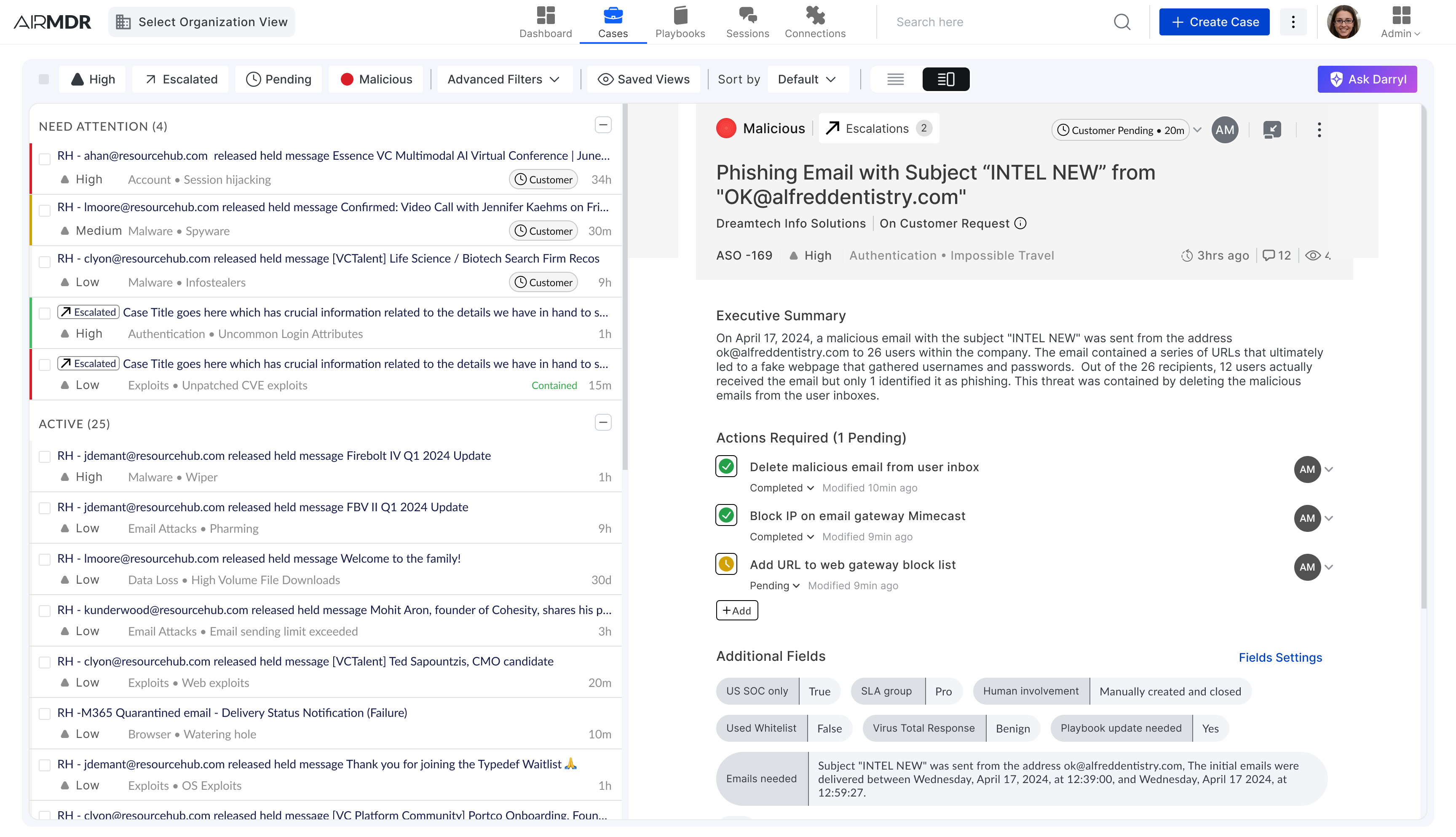
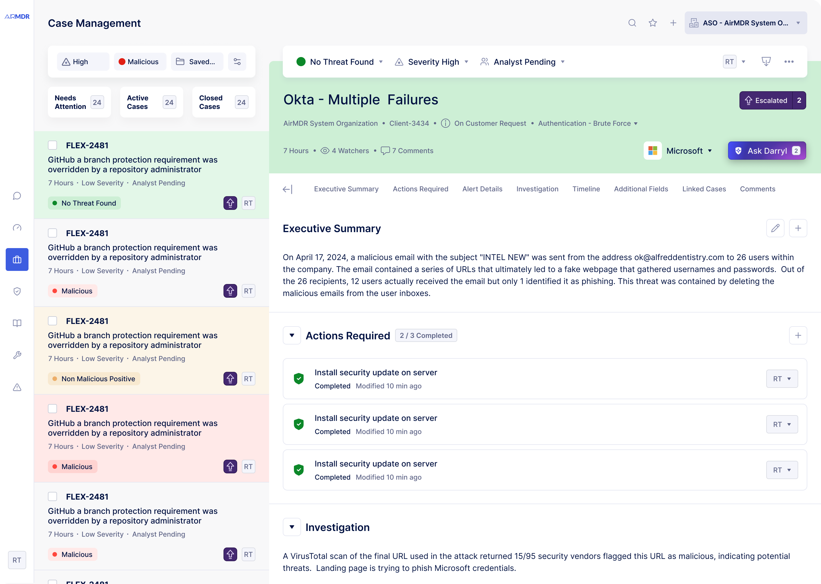
No information hierarchy

Critical escalations sat next to routine resolved cases with no visual differentiation. Analysts couldn't triage at a glance — everything demanded equal attention.

02

Broken case flow mental model

The path from "new alert" to "case closed" wasn't reflected in the interface. Analysts built their own workflows, leading to inconsistency and slower resolution times across the team.

03

Obsolete design system blocking development

A rigid, outdated component library required custom work for every new feature. Engineers were spending time on visual plumbing instead of product capabilities.

04

No familiarity anchors

The tool used patterns analysts had never seen in their daily work. In a high-stakes, time-pressured environment, that learning overhead had a direct cost on security outcomes.

Filter menus 
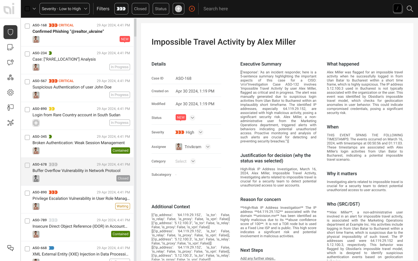
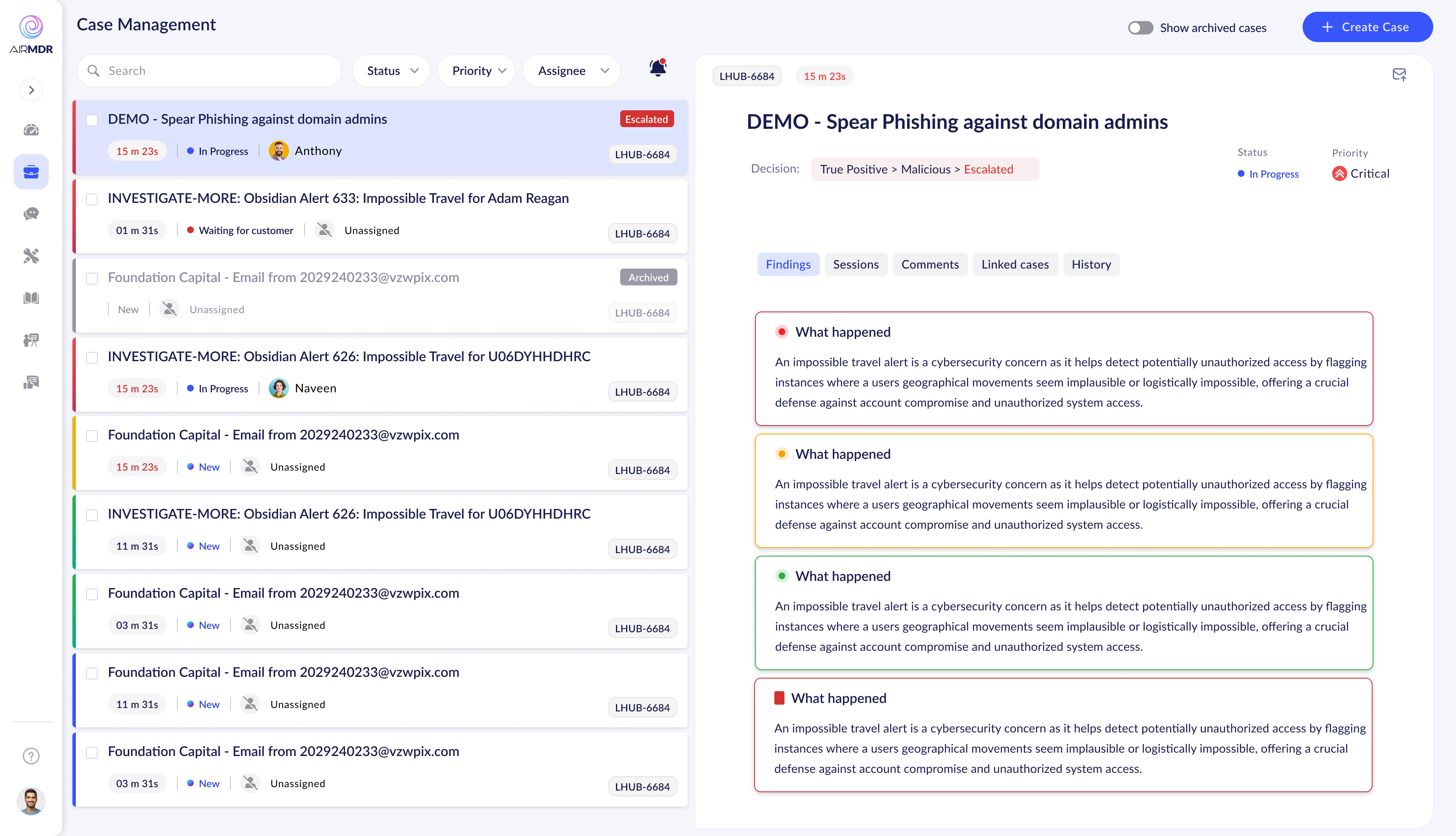
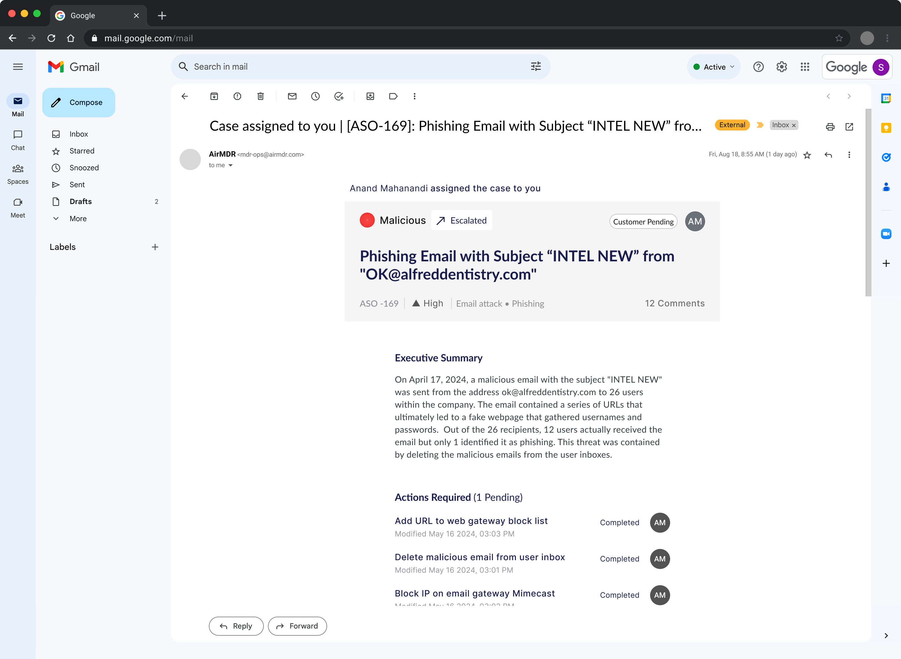
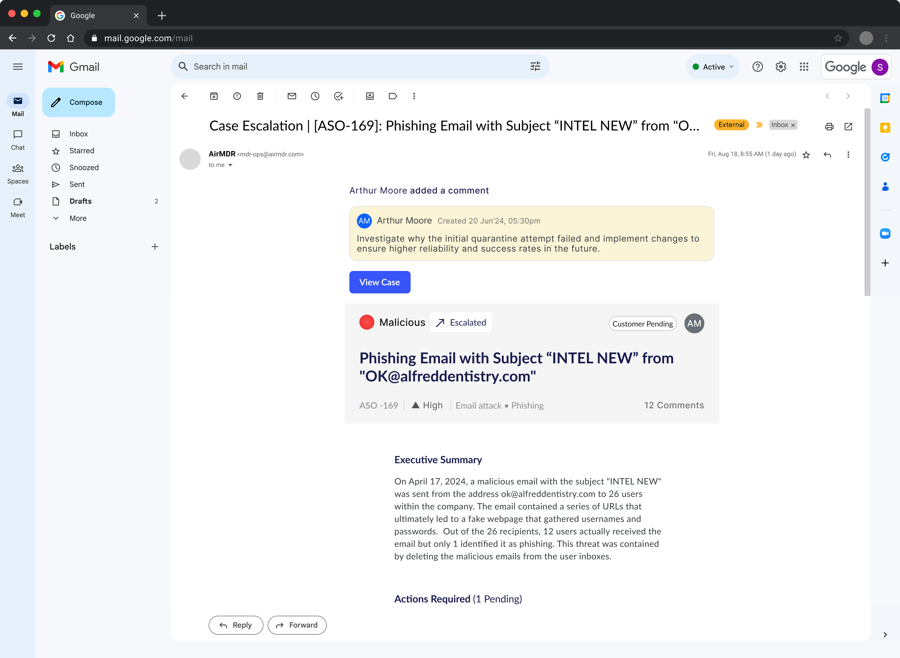
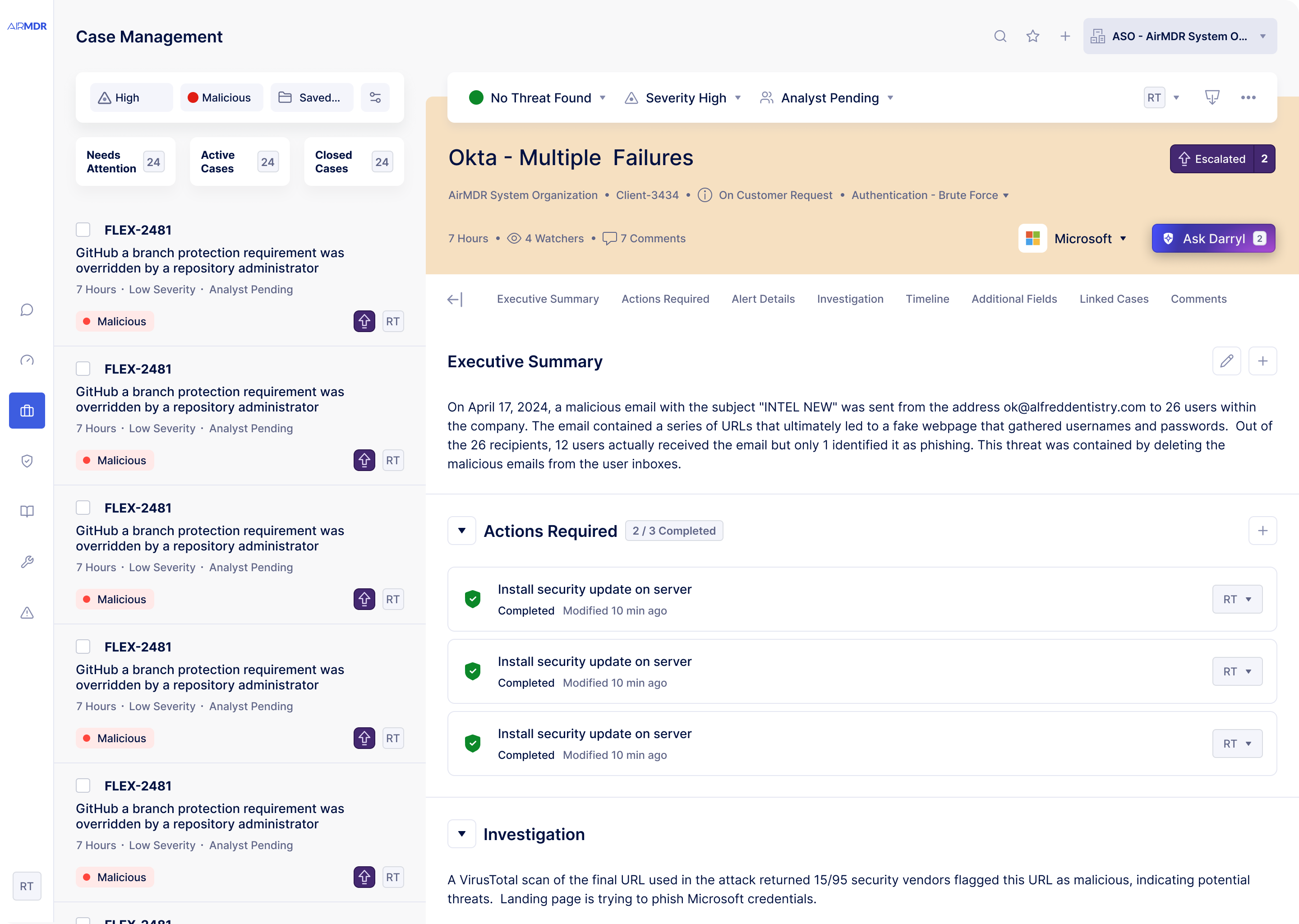
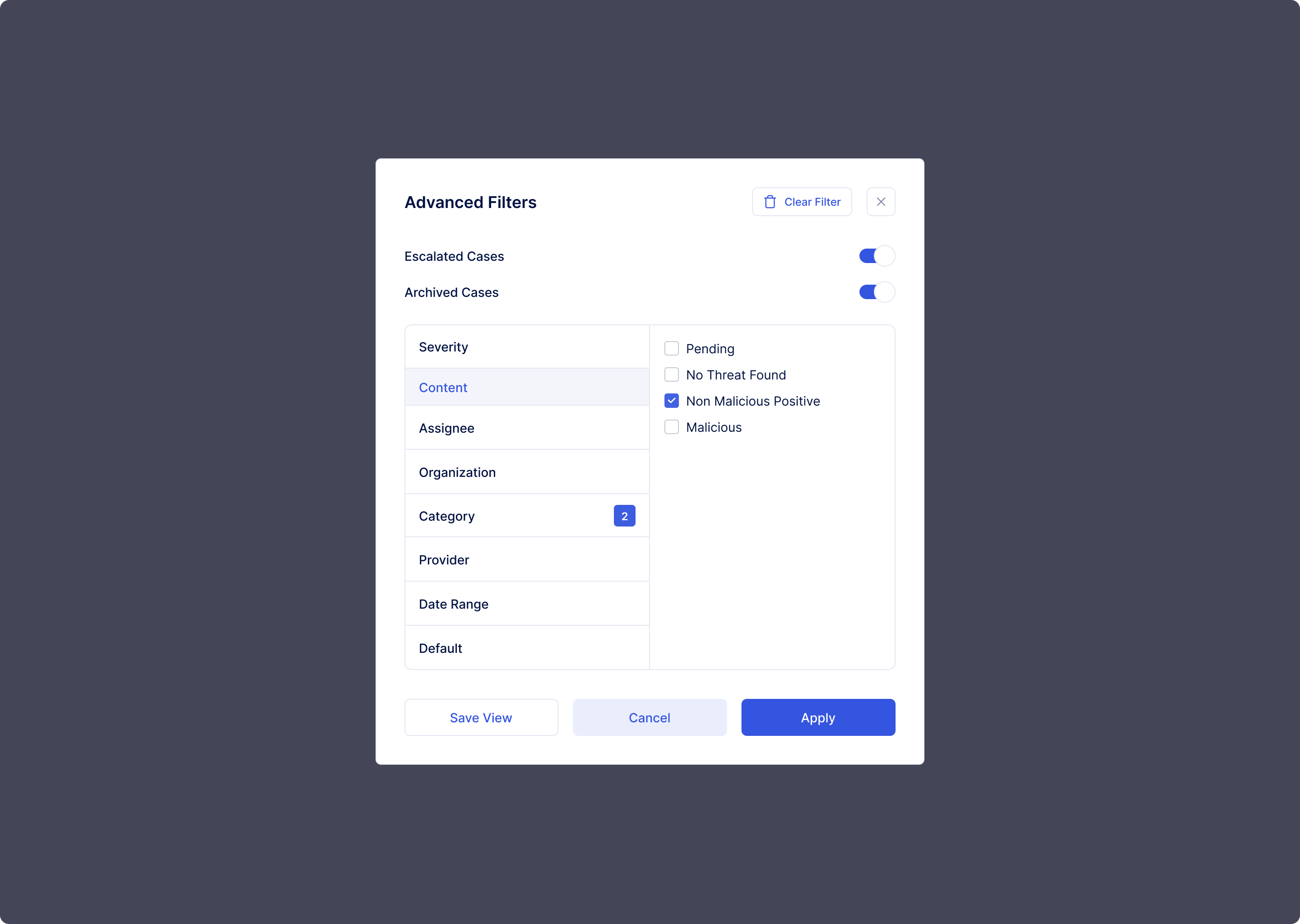
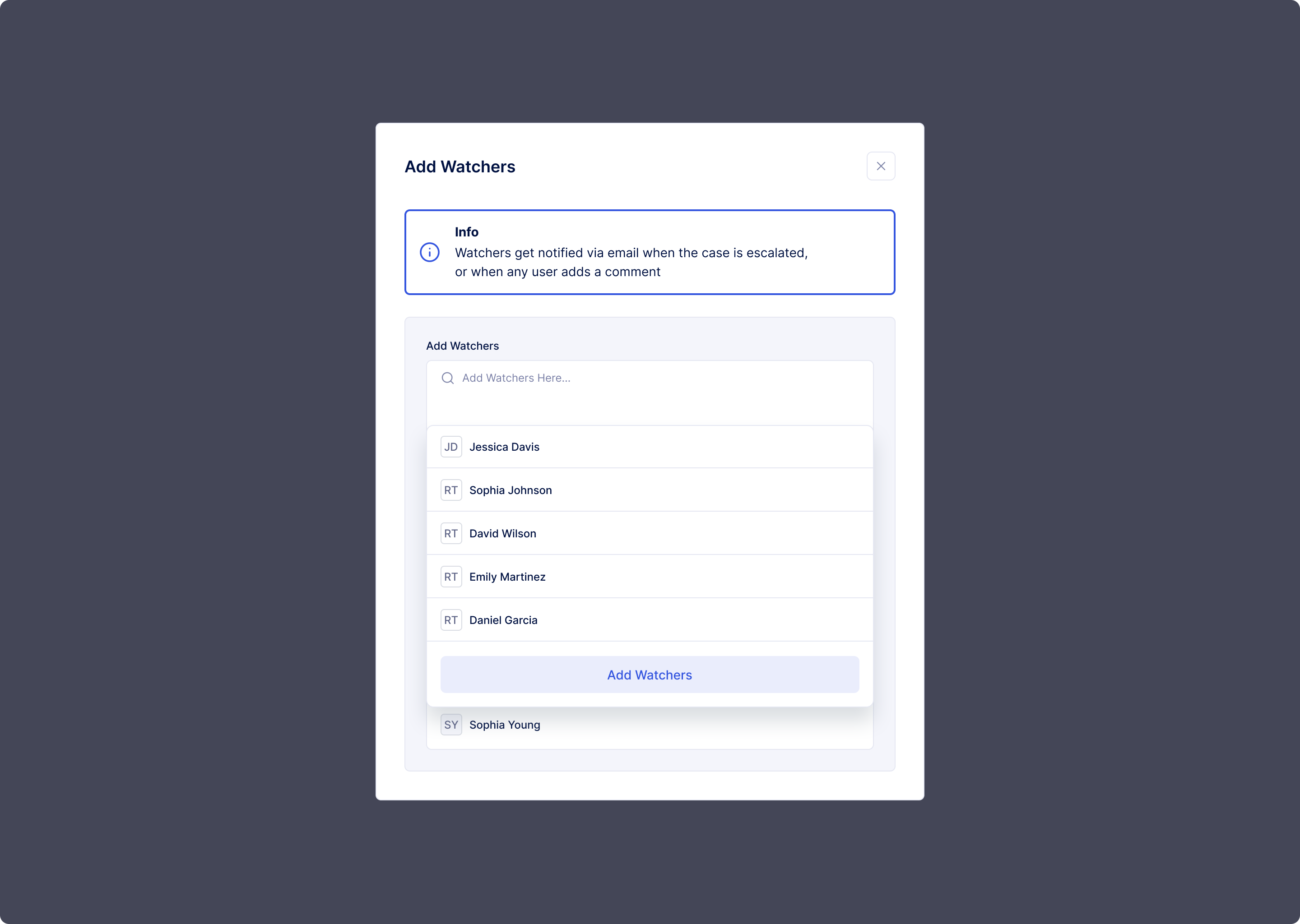
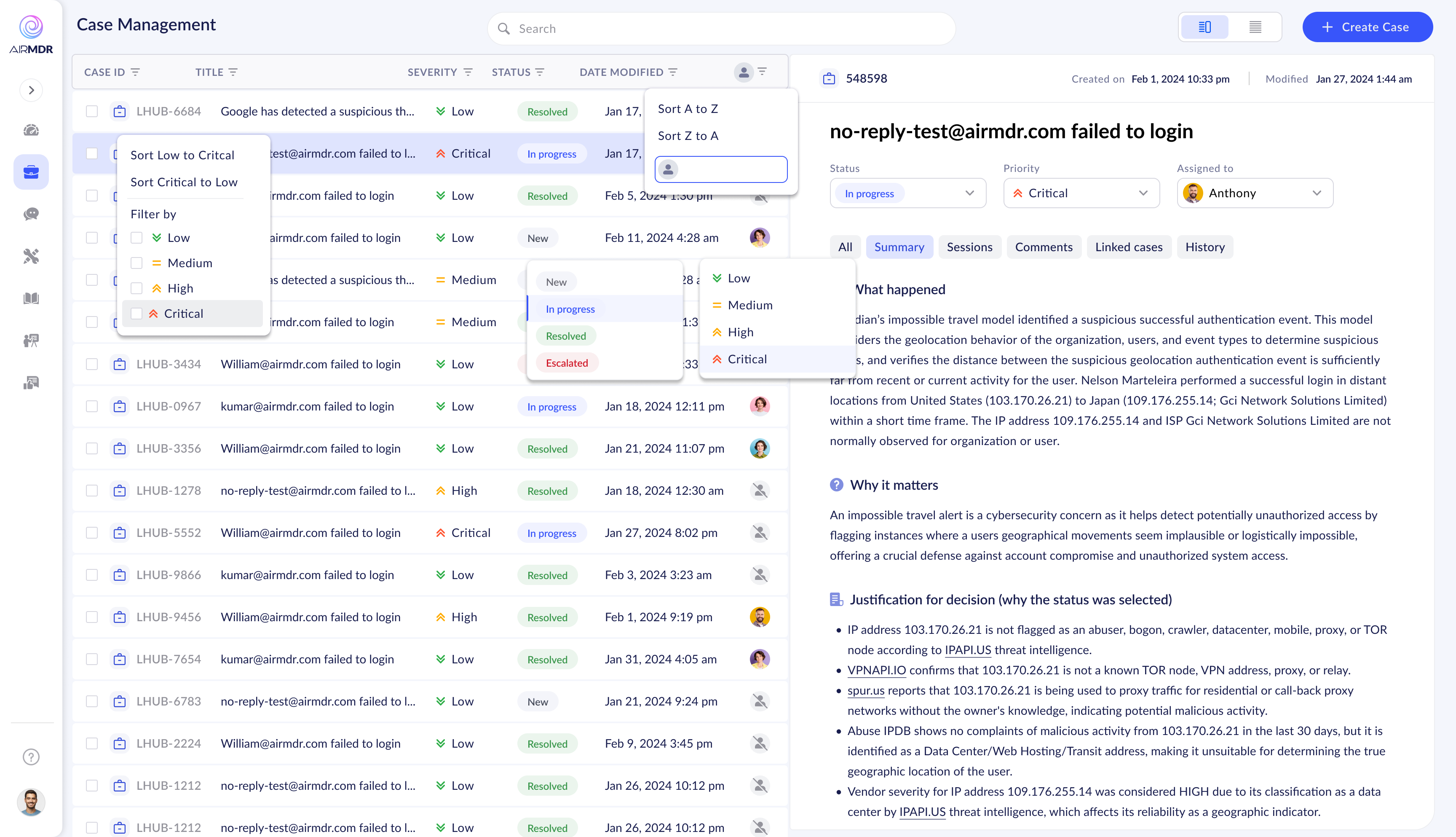
Cascading filter dropdowns — functional but unexplained affordances
Case detail with early timeline 
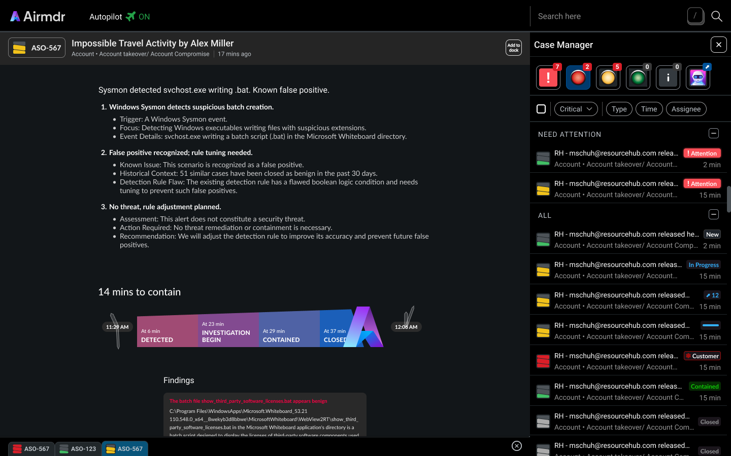
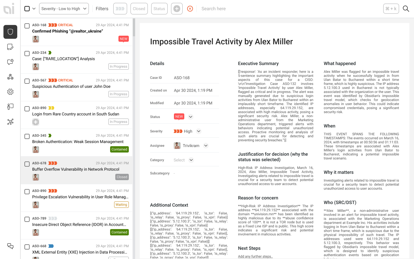
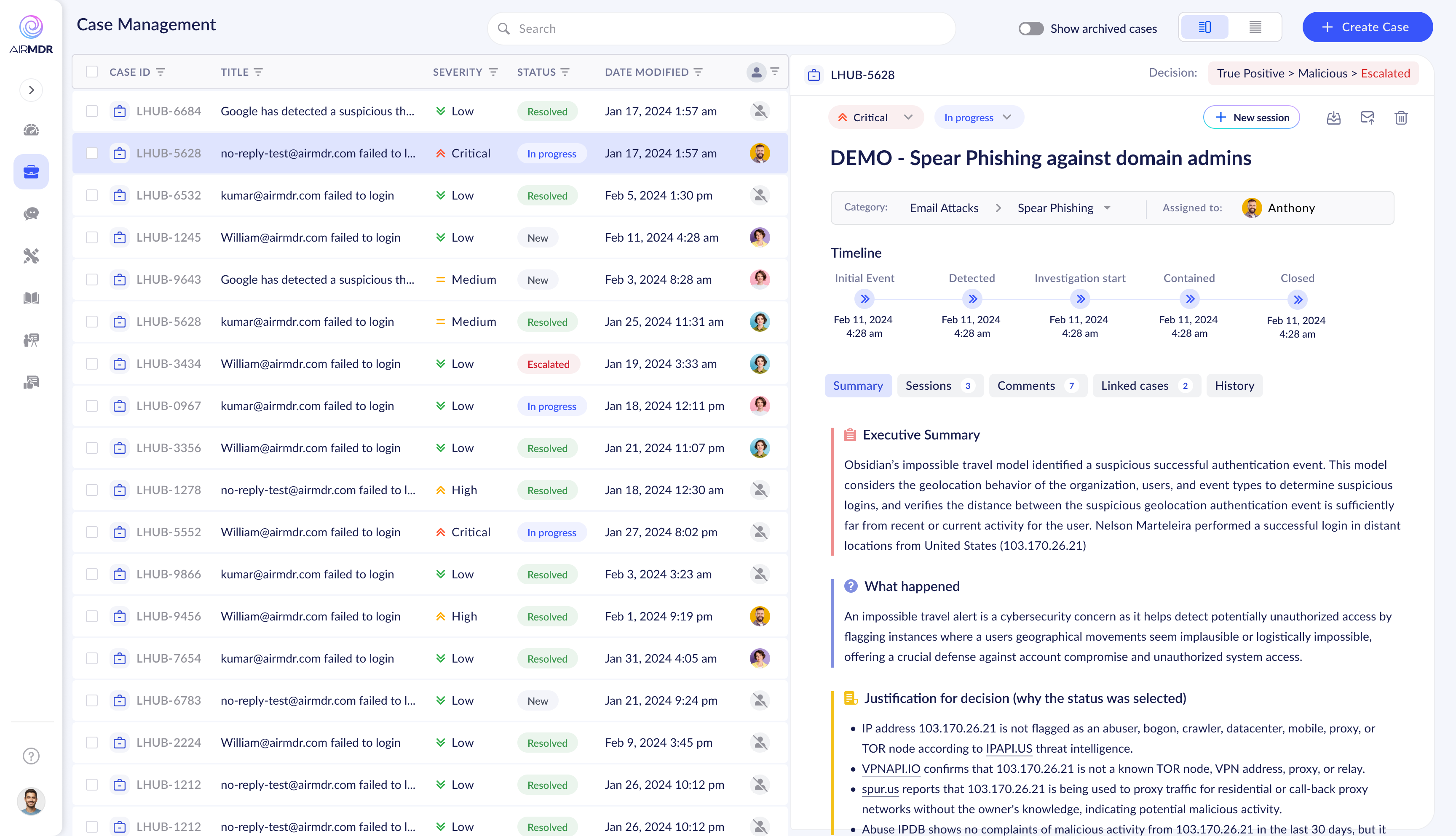
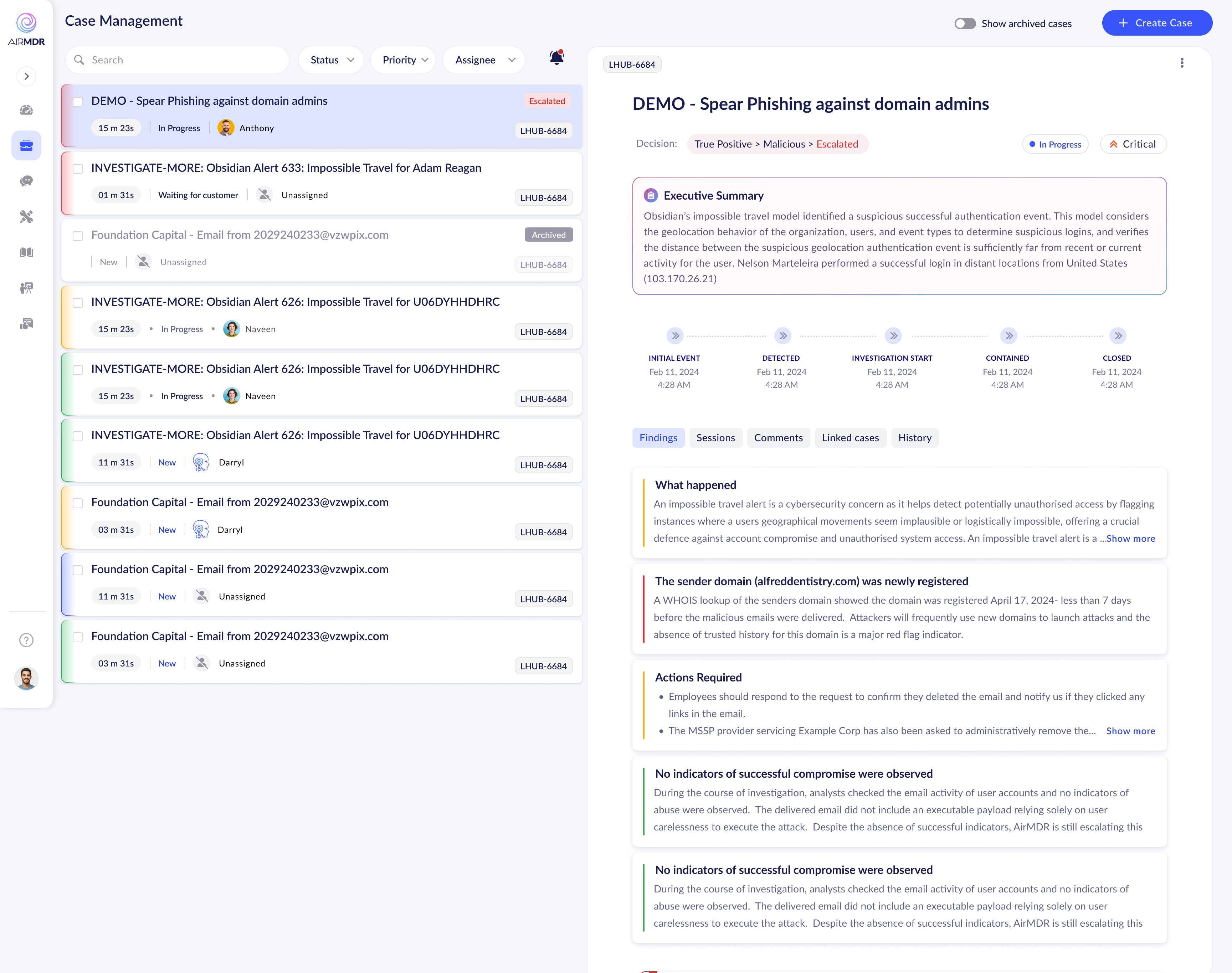
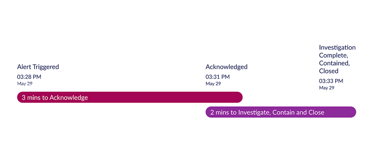
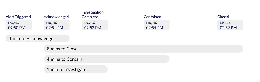
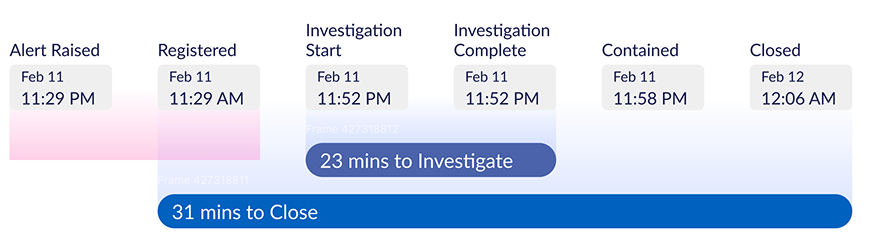
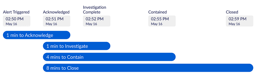
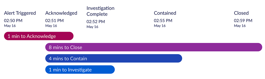
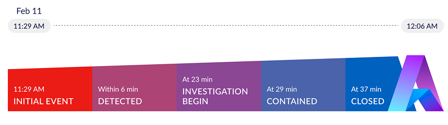
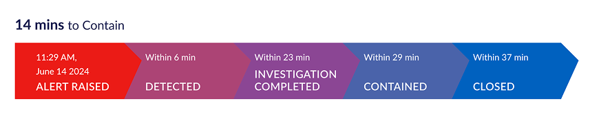
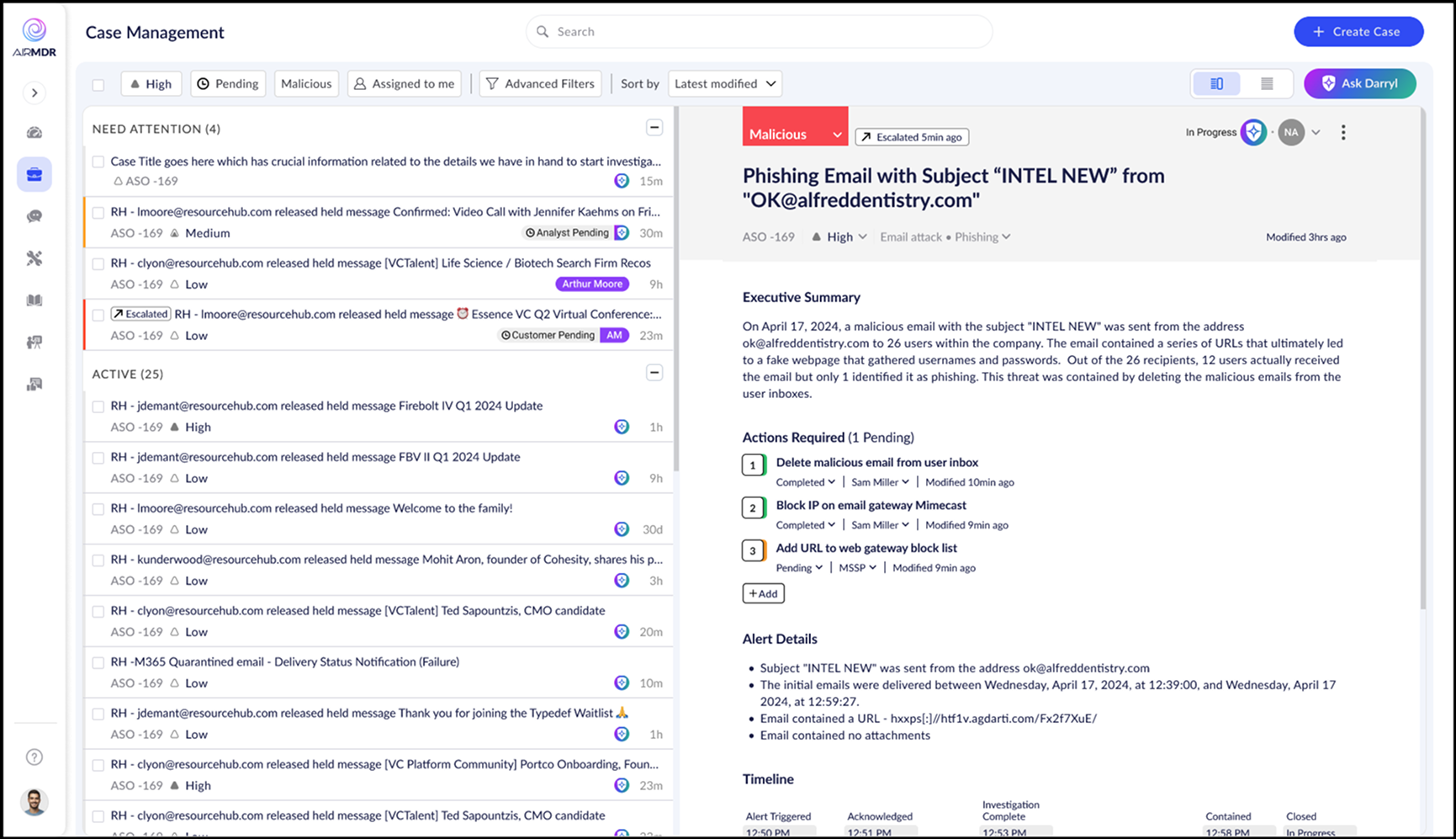
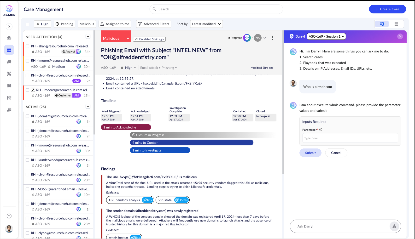
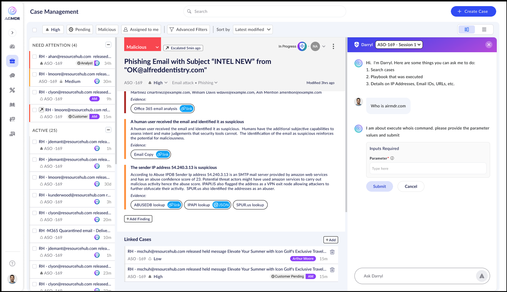
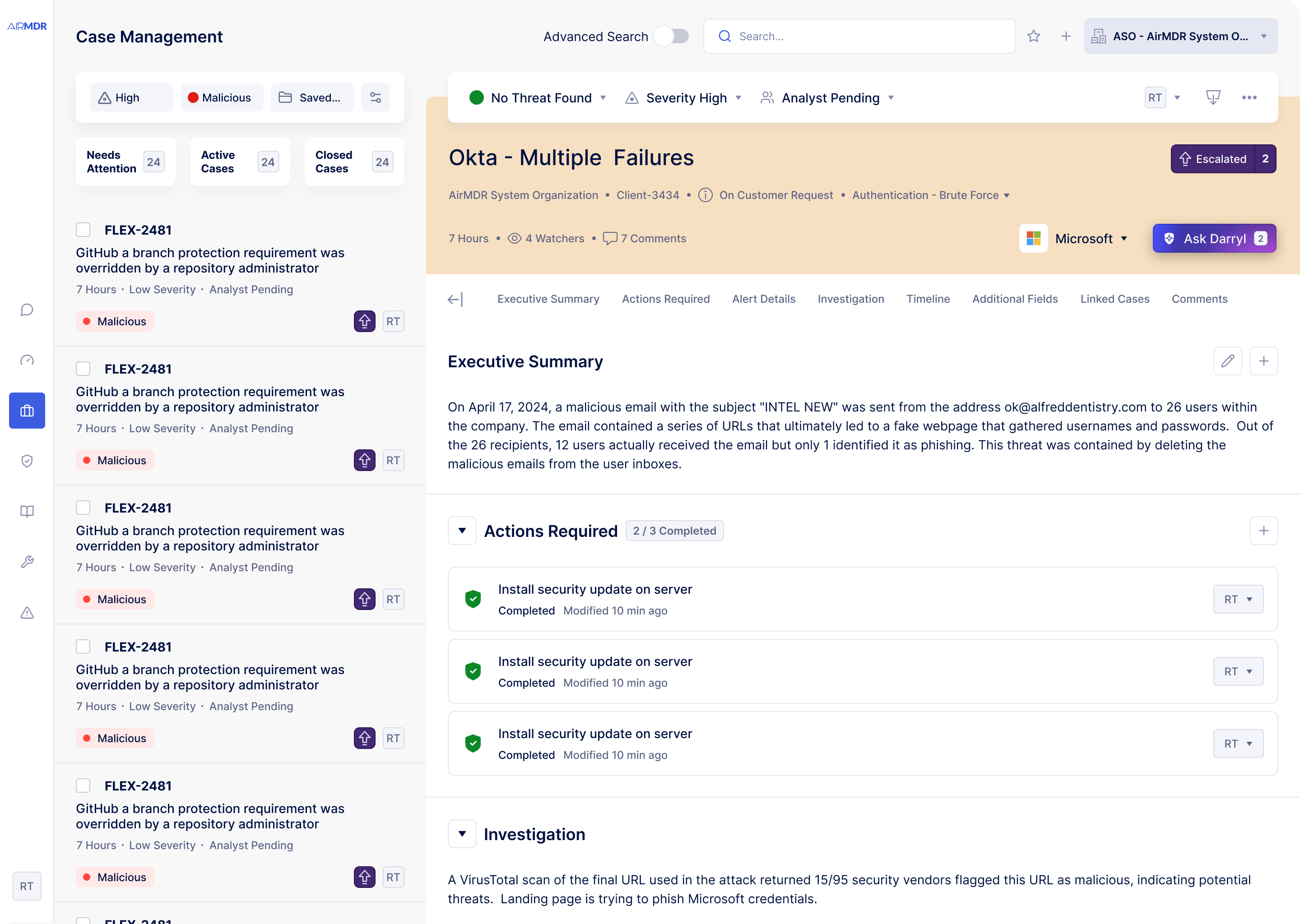
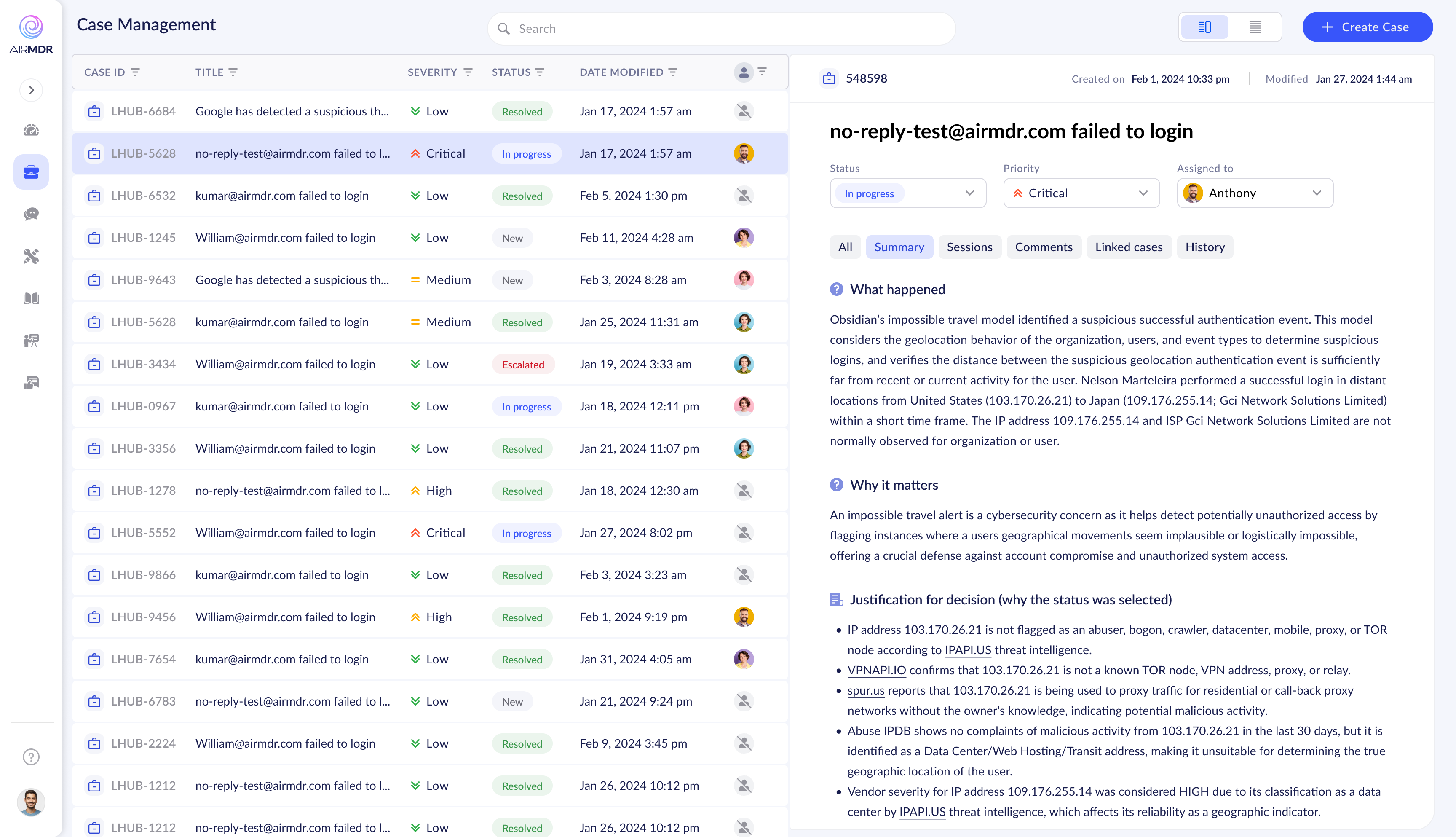
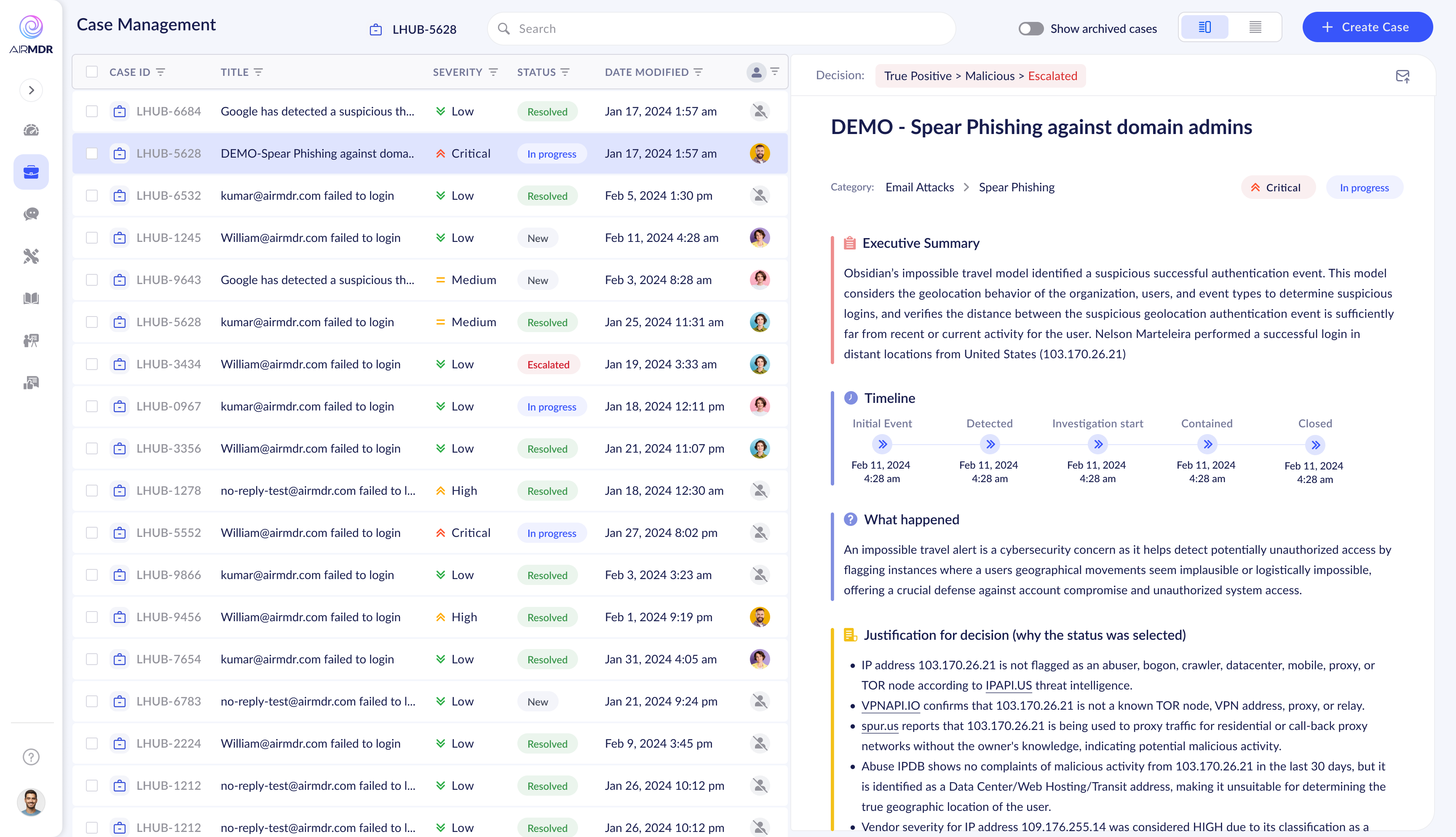
Early timeline in case detail — data present, hierarchy absent
02 / The Strategic Bet

Fix the flows first. UI can wait.

My first significant design decision wasn't about screens — it was about convincing leadership to sequence things correctly. The internal pressure was to "make it look better" fast. The real problem was structural.

I pushed to audit the information architecture, rebuild user flows, and establish a clear product mental model — then apply visual polish on solid foundations. For an internal tool, analyst efficiency mattered more than aesthetics.

This decision, made against some resistance, turned out to be the entire case study.

A visual refresh. Make the product look more modern, more polished, more impressive in sales demos.

Audit the IA, rebuild the user flows, establish a product mental model — then apply visual treatment on working foundations. Efficient first, beautiful second.

The existing system was slowing engineering to a halt. I proposed liberating developers: use any solid component library that respects the new user flows. Velocity first, visual consistency later.

Development velocity increased immediately. When the SAAS pivot happened, we had clean, validated flows ready for a proper visual system — not a pretty UI bolted onto broken architecture.

Initial design explorations

Four broad directions were explored before converging on the final approach. Each tested a different hypothesis about how analysts should interact with their case queue.

Exploration 1 Exploration 1 — Dark sidebar queue, content-first case view, Gantt-style timeline
Exploration 2 Exploration 2 — Compact list, expanded multi-column detail, newspaper layout
Exploration 3 Exploration 3 — Three-panel structure: list / details / content sections
Exploration 4 Exploration 4 — Decision breadcrumb in header, focused case detail panel

From exploration to convergence

After broad explorations, tighter iterations narrowed in on the right structure — refining list view hierarchy, case detail sections, and AI assistant integration.

Tabbed case detail emerging Emerging direction — tabbed case detail (Summary / Sessions / Comments / History), timeline in case header
Darryl AI introduced Darryl AI assistant introduced — right panel alongside case content, context-aware chat
Color-coded sections Color-coded finding sections — severity signalling through section borders, not just badges
Refined finding cards Refined finding cards — Executive Summary separated, cleaner visual weight hierarchy
Near-final compact list Near-final — compact list view, inline milestone timeline, progressive disclosure for findings
Interaction refinement Interaction refinement — hover states, inline edit affordances on finding cards
💡

The key shift: Analysts didn't need more data — they needed better sequencing of data they already had. The move from "show everything at once" toward progressive disclosure became the architectural spine of the final design.

03 / The Timeline Deep Dive

One component. Nine iterations.

The investigation timeline was the most iterated element in the entire product. It had to communicate a security incident's lifecycle — alert raised to case closed — in a way that was instantly scannable for a time-pressured analyst.

It sounds simple. Every design decision had a tradeoff between information density and cognitive clarity. Nine iterations to get it right.

"The timeline wasn't decorative. It was the single most important data point for understanding case efficiency — and whether SLAs were being met. Getting it wrong meant analysts would ignore it entirely."

V1
Start
Timeline V1
Simple duration bars between named stages. Correct data — but the bar metaphor doesn't match analyst mental models. They think in milestones, not spans.
V2
Pivot
Timeline V2
Multiple stacked bars — more data visible but cognitive load is too high. Reading 4 duration numbers to understand one incident creates fatigue in an already demanding environment.
V3
Shift
Timeline V3
Milestone node model — departure from bars entirely. Labeled timestamps, connected stages, left-to-right progression. Analysts understood the incident arc immediately without explanation.
V4
Refine
Timeline V4
Nodes with inline duration labels. Time elapsed between each stage shown on the connecting line — reducing mental calculation. SLA awareness begins to emerge.
V5
Compact
Timeline V5
Collapsed durations as expandable chips. Compact and scannable, but the chips add a UI layer that feels unnecessary — tested less well than V4's directness.
V6
Color
Timeline V6
Color enters at the node level. Green = within SLA, orange = approaching threshold, red = breached. The timeline now communicates urgency, not just sequence — a fundamental shift in its function.
V7
Breakthrough
Timeline V7
Color-coded nodes, elapsed time per stage, SLA targets inline. Analysts scan the entire case lifecycle in under 2 seconds. This was the breakthrough — subsequent versions were refinement, not reinvention.
V8
Polish
Timeline V8
Consistent visual weight — node sizing, label placement, and color treatment refined. Node sizing now clearly differentiates completed stages from pending ones.
Ship
Shipped
Final shipped timeline
The shipped design: Color-coded milestone nodes (green / orange = SLA health), elapsed time labeled between each milestone, Customer and Analyst SLA targets shown inline. At a glance: where is the case, how fast is it moving, is anything at risk?
🎯

Why this level of iteration mattered: The timeline was read dozens of times per analyst per day. A 5-second comprehension reduction, multiplied across a full team's workday, is a measurable efficiency gain. This component became one of the most-demoed features after the SAAS pivot — enterprise buyers understood its value immediately.

04 / The Familiarity Strategy

Borrow from Gmail. Own the context.

One of the most impactful decisions in this project wasn't a new invention — it was a deliberate act of borrowing. SOC analysts, like most knowledge workers, spend hours every day in email. Gmail's interaction model is deeply embedded in their muscle memory.

I mapped Gmail's information architecture onto the Case Manager's structure. The result: analysts felt oriented from day one — no onboarding needed. The mental model already existed in their heads.

Inbox — list of emails: sender, subject, preview, timestamp

Open email — full content, reply actions, thread context

Labels & folders — categorization and filtering system

Priority Inbox — flagged items surfaced above the fold

Unread markers — visual signal for items needing attention

Case Queue — list of cases: severity, title, assignee, age

Open case — full detail, action items, investigation thread, evidence

Categories & filters — severity, status, type, assignee filtering

Needs Attention — escalated / SLA-breaching cases surfaced first

Status badges — New / In Progress / Escalated / Resolved markers

"When an analyst opens Case Manager for the first time and feels like they've used it before — that's not an accident. That's the design doing its job."

The parallel extended beyond the tool. Escalation emails sent to clients were designed using the same information architecture as the in-tool case view — so when a client received an email and clicked through, they were looking at the same structure on both surfaces.

Gmail showing an AirMDR escalation email

↑ The escalation email as seen in Gmail — same hierarchy as the Case Manager: decision state, case title, organization context, executive summary, actions required. Client navigates from inbox to tool with zero disorientation.

Assignment email Assignment notification — mirrors the case list item structure and language
Escalation email Escalation email — same section order as the in-tool case detail view
✉️

The continuity payoff: Clients who received escalation emails and opened the tool reported significantly less confusion about where to take action. The same mental model worked across both surfaces — reducing support load and improving client satisfaction scores.

05 / The Final Internal Tool

UX solved. Ready to perform.

After fixing the information architecture, rebuilding user flows, and validating the Gmail mental model, the final internal tool came together. Visual polish was kept clean and functional — this was still an internal product, and analyst efficiency was the metric that mattered.

But the experience was fundamentally transformed. Clear queue, structured detail view, embedded AI, actionable workflows, consistent language from email to tool.

Final internal Case Manager
↑ Final internal tool: "Needs Attention" cases grouped at top with count, active filter chips visible inline, decision breadcrumb in header, structured case detail with action tracking and assignees.
Final tool with Darryl AI panel

↑ AI assistant "Darryl" embedded inline — analysts query case-specific context, run threat intelligence commands, and get structured results without leaving the case. Contextual to the open case, not a generic chatbot.

Final tool — findings and evidence

↑ Findings section — structured evidence cards with inline links to external threat intel (VirusTotal, WHOIS, URL Sandbox), color-coded severity, progressive disclosure. Heavy detail, light cognitive load.

Client-facing view

↑ Client-facing view — same architecture, scoped to the client's organization. The top navigation now exposes the broader product surface: Dashboard, Playbooks, Sessions, Connections.

What was solved: Triage hierarchy via "Needs Attention" grouping · Consistent case lifecycle flow from alert to closure · Gmail-parallel interaction model (zero onboarding) · Contextual AI assistance (Darryl) inside the case view · Structured action tracking with assignees and timestamps · SLA-aware timeline at a glance · Unified email ↔ tool information architecture.

06 / The Turning Point
The Turning Point

At Black Hat USA, major MDR providers saw a live demo of the internal tool. Instead of hiring AirMDR to manage their security operations, they asked to license the platform and run it with their own analysts.

The internal tool became the product.

What was built as operational infrastructure for service delivery had standalone commercial value as software. Enterprise MDR providers weren't impressed by the AI automation — they had their own. They were impressed by the analyst experience of using it.

The UX was the differentiator. The flows, the mental model, the timeline, the queue logic, the embedded AI — all built with the human analyst at center. That's what enterprise buyers wanted for their own teams.

AirMDR pivoted to SAAS. The internal tool needed one final transformation: from efficient to beautiful.

"The design decisions made for internal efficiency — fixing flows before pixels — created the conditions for a product that enterprise companies were willing to pay for as software."

07 / The SAAS Visual Revamp

Same foundations. New identity.

The SAAS revamp was delivered in 2 months. A complete design system was built from scratch — tokens, components, patterns, documentation. The Case Manager remained the centerpiece, receiving both a visual overhaul and refinements informed by months of real analyst usage.

The brief was clear: the flows are validated, the UX works. Now make it feel like a product a CISO would be proud to show their board.

SAAS Case Manager — full visual redesign
↑ SAAS Case Manager: refined typography system, decision state anchoring the header (Malicious / No Threat Found / etc.), tabbed section navigation, structured action tracking with completion states. Same flows — new visual language.
Decision state color system

↑ Decision state color system — each outcome has a distinct color spanning the entire case header. Analysts identify a case's resolution status from the list view's color signature before opening it.

Global search and saved views

↑ Global search and saved views — enterprise-scale deployments need structured filtering across hundreds of cases. Saved views allow teams to create persistent filtered workspaces for specific analyst roles or client portfolios.

Escalation flow redesign

In the SAAS product, escalations now crossed organizational boundaries. Every step of that cross-org action needed to be transparent, controlled, and confirmable.

Escalation — compose Step 1 — Compose message, toggle email notification
Escalation — watchers Step 2 — Add watchers, preview recipient list
Escalation — confirm Step 3 — Confirm org, recipient, and escalation action

Full modal system

The design system included a complete set of modal variants — close case, decision update, action assignment — each following the same structural pattern for muscle memory across the product.

Close case modal Close case modal
Decision update modal Decision update modal
Action assignment modal Action assignment modal
🏗️

Why 2 months was achievable: Because the flows were already solved. The SAAS revamp was purely a visual and system-building exercise. The decision to fix foundations first — made a year earlier against internal pressure — created the conditions for a 2-month delivery. Without that sequencing, a SAAS-quality redesign would have taken 6–8 months minimum.

08 / Outcomes

The numbers that made the case.

The results showed up in business metrics, in sales conversations, and in the strategic direction of the entire company. What started as an internal efficiency project ended in a company pivot from services to software.

More Technical Wins in Sales

Product demos became the deciding factor in competitive enterprise deals. Prospects saw the tool and wanted to own it for their teams — directly catalysing the SAAS pivot.

32%
SOC Analyst Efficiency Gain

Measured improvement in cases resolved per analyst per shift. Attributed directly to reduced cognitive overhead, clearer workflow structure, and elimination of context-switching.

Top 3
Customer Purchase Driver

In customer research, Case Manager experience ranked in the top three reasons customers chose AirMDR over established competitors — ahead of price in several accounts.

2 mo
SAAS Revamp Delivery

Full design system plus SAAS-quality visual redesign delivered in 2 months. Only possible because the UX foundations were already solid and validated by real usage data.

What this project taught me

01

Internal tools are products

The quality of an internal tool's UX directly impacts business performance. SOC analysts using a better tool produce security outcomes that clients notice — and pay for.

02

Sequence matters: IA before UI

Fixing information architecture and user flows before applying visual design created a foundation that could absorb a major revamp in two months when the business need suddenly arose.

03

Familiarity is a design asset

Borrowing Gmail's architecture was strategy, not laziness. Analysts came to the product already knowing how to use it — fewer errors, faster adoption, higher confidence in high-stakes work.

04

UX can be the product pivot

The SAAS transformation wasn't driven by a new technology. It was driven by the experience of using the product. Enterprise buyers saw what good UX felt like and wanted to own it.

"This project is proof that treating UX as business strategy — not just delivery — creates compounding returns. The decision to fix flows before pixels, made against internal pressure, is what made all of this possible."